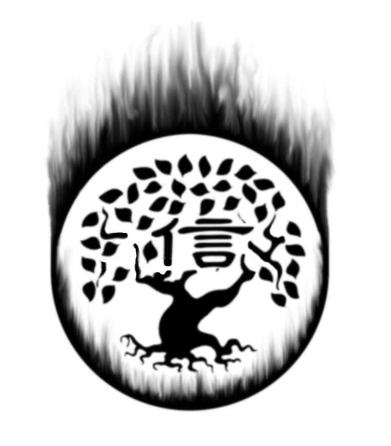
As the people who are close to me know, I’ve been looking for a tattoo design for a while now and have had no luck whatsoever with my search. All the tattoos out there on the net seemed too silly, too vulgar, too impersonal or too generic. Nothing leapt out at me and hollered, “Me! Me! You want ME on your back forever!” With d-day approaching and an agreement between Evan and myself looming over me, I finally decided that I needed help. The problem was, I didn’t have the first clue what I wanted. I knew I wanted something reflective of myself, a simple design without pretension that was symbolic of some of my core values. (It should be noted here that the author, in a nerdiness fervor, nearly convinced himself to scrap the whole ‘symbolic values’ motif and simply get the symbol of Captain Marvel tattooed on his back. THIS is precisely why you should NEVER decide on a tattoo whilst drinking… it still sounds very kewl to him tho, possibly for a second tattoo)
Salvation came the other day though when I roughed out a crude representation of what was floating in my head and gave it to my artist friend. He took the cave drawing home and promised to put some thought into a design and we would figure it out from there. Then last weekend while we were playing cards at my place, my artist friend starts sketching out a design right there. And it clicked. That was it! Well, the beginning of ‘it’ anyways. With that bit of inky magic set more firmly in my mind I was able to cobble together this rough photoshop design that is very close to what I want and with a little more work it may be perfect. As always, any comments or advice are welcome=)
3 comments:
I would love to know your thought process behind it and what it stands for. I like the tree and symbols A Lot. It's original and would translate into a tattoo very well. My only concern is about the fiery ring. Edges of a tattoo tend to soften and spread a little over time so you may end up with just a ring of blobbage. Making the individual flames big enough to work would probably detract from your core image. IMO, I'd ditch the fire and maybe find another design to circle it or leave it out completely. It's very nice without it. How big are you thinking? Did you happen to see the Miami Ink episode where Kat did this MC Escher puzzle on some guy's back? That was seriously cool.
i totaly dif the firey image to cool. but shel is right over time it could end up turning into something else. but first take it to a Inkshop and see what they have to say about it, they would know best.
stamn
Nice. Personal, unique and just a little mysterious(to those of us who can't read the writing anyway).
Post a Comment